How to design promotional signs that grab your customers’ attention
Designing an effective promotional sign is much more than picking eye-catching colours or adding discounts. It is a key tool to catch your customers’ attention and guide them towards a specific action within your point of sale.
That is why today we are going to talk about how to create promotional signs for stores and points of sale that really work and reinforce the shopping experience for customers in your supermarket or store.
Essential elements of promotional signs for stores and points of sale
To start, you need to be clear about what message you want to send. Think of the target customer and what you want to achieve:
- Promote a product?
- Highlight an offer?
- Guide customers towards a specific section of your store?
A good eye-catching offer sign should also include certain key elements.
- A clear, attractive headline. Use short, powerful phrases. For example: “2×1 on selected products” or “Exclusive discount today“.
- Legible typography. Choose simple, large fonts and avoid overly decorative letters that hinder reading.
- Use colours that contrast with the surroundings and reinforce your brand identity. Red, for example, is ideal for highlighting promotions.
- Calls to action (CTA). Phrases like “Get yours now” or “Ask at the checkout” motivate the customer to act.
- Quality images. Make sure any graphic or photo you use is professional and relevant to the offer.
Specific designs by store type
Not every promotional sign for supermarkets is the same as one you might use in a boutique or an electronics store.
So you should always tailor the design to the characteristics of your business.
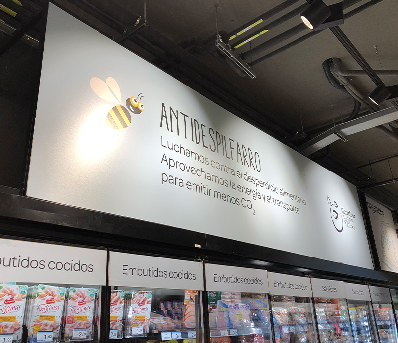
- In supermarkets, signs must be large and visible from a distance. Use strong colours and clear text to highlight offers on basic products. Internal promotional signs also work well for specific sections such as the bakery or the butchery.
- Clothing stores. Signs for fashion stores are usually more stylised, with a minimalist design that reflects elegance. Highlight discounts like “Up to 50%” or seasonal promotions.
- Tech businesses. Use modern, schematic graphics that complement the products.
Where to place promotional signs at your point of sale
The placement of supermarket signage or point-of-sale signage is just as important as its design — if the customer does not see it at the right moment, you lose a unique sales opportunity.
- Store entrance. Place signs that catch attention from the outside. An eye-catching offer sign at the door can attract customers who had not planned to come in.
- Main aisles. Use signs to guide shoppers towards specific promotions.
- Checkout areas. Small advertising signs in this area are ideal for suggesting last-minute products or highlighting extra discounts.
Common mistakes to avoid
When designing your signs, avoid these mistakes that can hurt their effectiveness.
- Information overload. Too much text or graphics can confuse the customer. Keep the design clean and focused.
- Wrong placement. A sign placed in a low-visibility area is a wasted resource.
- Spelling or design errors. These clearly affect the credibility of your business and create an unprofessional impression.
Strategies to measure the effectiveness of your signs
Finally, once the signs for your store are in place, do not forget to evaluate their impact. You can do this in the following ways:
- Observe customer behaviour. Check whether customers stop in front of the sign and act on the message it carries.
- Compare sales. Analyse how the sales of promoted products change before and after putting up the sign.
- Run surveys. Ask your customers if they saw the promotions and what they think of the design.