Organising shelf promotions: keys to highlighting offers and boosting sales
A good promotion can boost your sales… but only if it is well placed.
The organisation of promotions on the shelf is not just about putting discounted products on any shelf — it is about designing a shopping experience that catches the customer’s attention at the right moment.
Location, order, colours and signage make the difference between an offer that sells and one that goes unnoticed.
Why is it so important to organise shelf promotions properly?
The key points you should be clear on before organising promotions are:
- Poorly placed promotions do not generate sales.
- A good location can boost conversion by up to 30%.
- Organisation influences the perceived value of the product.
- A well-designed shelf drives impulse purchases.
- Clear in-store price communication reinforces customer trust.
Organising promotions well is not just an aesthetic question — the shelf acts as a silent salesperson that guides the customer and helps them make decisions.
When the product is badly placed or mixed without logic, it loses prominence and the promotion becomes invisible.
Price communication in your supermarket plays an essential role. If the difference between the original and promotional price is not clear, the customer does not perceive value.
Use large, visible labels with a coherent design — clarity conveys trust and creates urgency.
And do not forget that customers do not look for offers, they react to them. That is why you need to place them in high-impact zones, with a visual presentation that instantly grabs attention.
Shelf hot spots: where to place offers for maximum impact
The main key zones for placing your promotions are:
- Eye level
- Gondola ends
- Main entrances
- High-traffic walkways
- Areas near the checkouts
- Aisle ends
These are the so-called hot spots — areas which, thanks to their location and visibility, attract more customer attention.
Using them lets you display promoted products at the precise point where shoppers are most receptive.
By contrast, cold zones — such as low shelves, secondary aisles or poorly lit corners — should be avoided for this kind of product, as they generate neither visibility nor conversion.
Where should promotional products go to get more visibility?
The short answer: at eye level and in high-traffic zones.
The long answer: where the customer is already looking naturally. That is why gondola ends, entrance areas or spots near the checkout are ideal.
Do not make the customer search for the offer — make the offer reach them effortlessly.
Types of promotional spaces in the supermarket
The most effective spaces for placing promotions are:
- Gondola ends
- Promotional islands
- Mobile displays
- Entrance and exit zones
And each of these spaces plays a different role.
- Gondola ends are perfect for high-rotation products.
- Promotional islands work well for short-term or seasonal campaigns.
- Mobile displays offer flexibility to adjust the location to the customer flow.
Gondola ends, islands and aisle ends: which to choose?
- Use gondola ends to grab attention in the main aisles.
- Islands give greater prominence and a sense of opportunity.
- Aisle ends interrupt the natural shopper journey and surprise the customer.
- The best strategy is usually to combine them, rotating products and adapting the visual message to each space.
And where does a promotion have the most impact?
Generally, the first zones the customer sees when entering, gondola ends and waiting areas are the spots that convert most, because that is where the shopper is most attentive and likely to act on impulse.
Visual elements that boost the effectiveness of a promotion
Where you place them is essential, but how they are presented matters just as much.
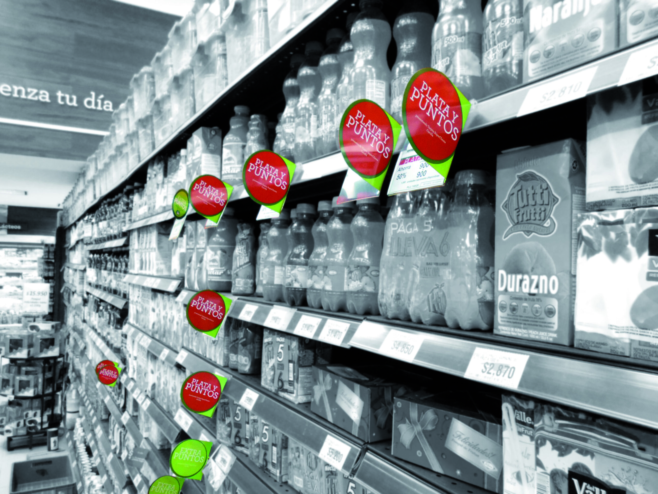
Colours, signs and signage are very important for catching the customer’s attention.
But beyond colour, what really matters is clarity.
That is why signs should have:
- Large, legible typography
- A clear contrast between the original and promotional price
- Short messages such as “2×1”, “today only”, “last units”
You can also use shelf stoppers, directional arrows, eye-catching labels or even materials such as floor vinyls that visually guide shoppers towards the promotion.
The goal is not to fill the shelf with visual noise but to create a focal point the customer can understand in less than three seconds. If you manage that, the promotion has already done its job.